Hey internet friends. Long time no see. I don't post much to Blogger these days. I am however available at the following places where I do post. Hope to see you there.
Instagram
tumblr
A Spider A Day
JLynchart.com

Thursday, December 29, 2016
Wednesday, November 11, 2015

If you've ever wondered what Pete gets up to in his off time go check out my Spider a Day blog, a semi-legit-kinda daily sketch blog all about everyone's favorite wall crawler.
Thursday, January 8, 2015

Sunday, October 26, 2014
Wednesday, July 30, 2014


Thursday, July 3, 2014

Friday, June 6, 2014


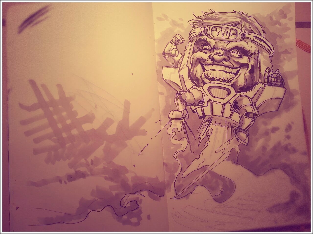
GOD-ZINE-LA!


Got my copy of GOD-ZINE-LA in the mail. Its a handsome book. Big thanks to Hamish for putting all the work into it.

Wednesday, April 2, 2014
Sunday, March 30, 2014
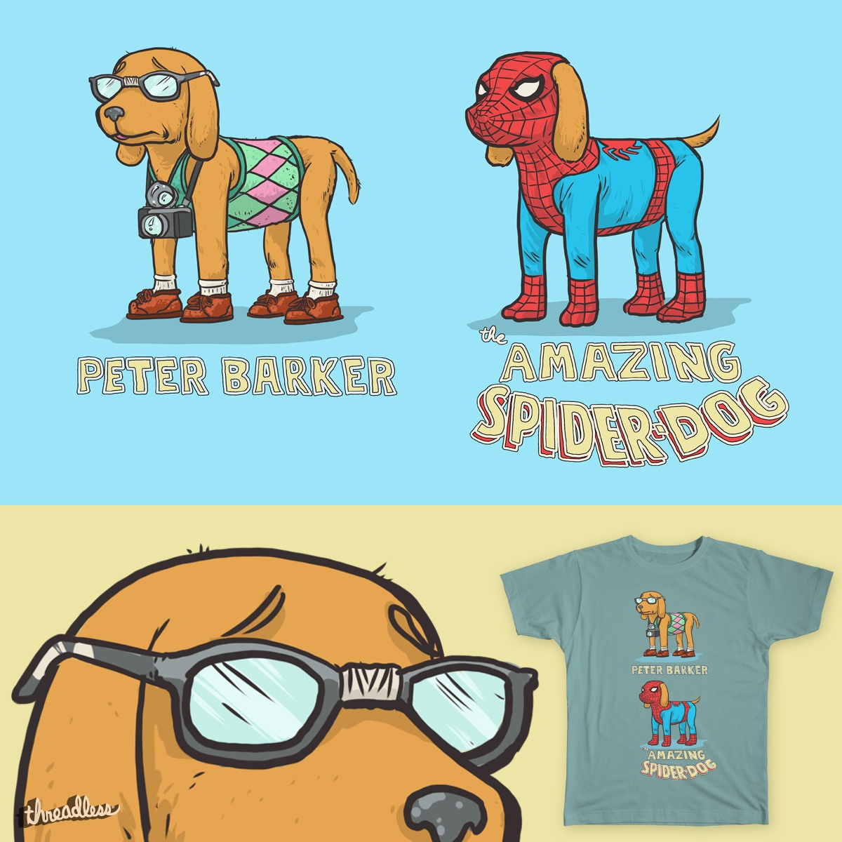
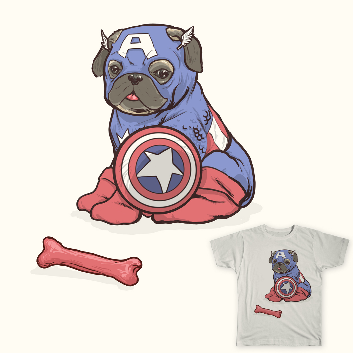
All American Hero (contest)
Hey, so I've got this design up on Threadless. If you'd wear this shirt (or have it printed on a phone case or back pack) go vote for it. I'd wear the shit out of it.... although I am biased. And it would probably be weird to wear my own art. I don't even have any hanging in my house, so maybe I wouldn't wear it. But that shouldn't stop you!
VOTE FOR MY DESIGN ON THREADLESS
VOTE FOR MY DESIGN ON THREADLESS
Sunday, March 23, 2014
Looking for friendship


Thursday, December 12, 2013


Saturday, September 14, 2013
Storm Redesign

Here is my entry for Project Rooftop’s, Storm: All Weather Wear contest. This one is being judged by Brian Wood and Kris Anka
so I couldn’t miss it. I love Brian’s stuff. His recent run on Conan
with Becky Cloonan was killer… and the James Harren fill in was fucking
nuts. I was fortunate to work on some of his books when I used to be
Ryan Kelly’s Art Assistant. And Kris Anka…. what a dick. He is too
awesome. Have you seen this dude’s designs? He cranks out art like he
breathes air. Even his sketches are brilliant. The best thing about
these guys is their engagement with the community, fans and peers
alike. I really appreciate that.
This one was a bit intimidating because Anka just redesigned storm and its pretty unbelievable how good it is. For this design I tried to go a different direction and play with a more practical approach to her outfit. I literally wanted to give her something for all seasons. I also wanted to play up this Kenyan angle but then there’s the bit about her growing up in Egypt and being worshiped as a god and all so I wanted her to be true to her roots at the same time. So this is my attempt to shoehorn all that into one design. That being said I was really crunched for time on this and frantically made it last night and finished it today at work. I think I got it in within an hour or so of the deadline.
sidenote:Thanks to House Industries for the font sampler!
Subscribe to:
Posts (Atom)